To accurately tell a story, sometimes pictures can say more than words. By combining text with rich content, multimedia pieces allow journalists to convey more, enhancing their writing as well as the story itself.
New York Times Multimedia
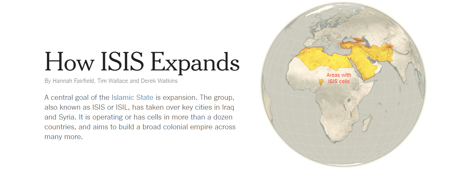
One of the most famous news organizations, The New York Times, is one of the best at producing quality multimedia pieces that cover a broad range of topics, from daily life in New York City to avalanches. In a more recent article, The New York Times created a series of maps showing the expansion of the Islamic State.

Rise of ISIS
Sweeping the Middle East, ISIS quickly took control of large areas of land, claiming it for their newly formed caliphate and killing thousands of people along the way. To show the rapid spread, the Times created a series of maps and images to show the spread of the group. Broken up into three segments, the maps show different parts of the rise of the group, though governance, infiltration, and allegiance.
Overall Impressions
As with many of the multimedia pieces by the newspaper, the content was easy to navigate as it was presented in a linear form and was easy to understand because of the headings above each segment. The strength of the article is its simplicity while explaining a complex story. The only thing that I believe could have helped the article would have been to make the maps interactive. However, the amount of time that goes into creating more interactive maps can delay stories that have a strict timeline.
With great graphics, excellent explanatory writing, and the ability to combine them both, the multimedia article depicting the growth of ISIS is a great example of how data visualizations can expand a story.
You must be logged in to post a comment.